Saturday 29 January 2011

Flag and type (Dead Man's Shoes ident)


I've just tried to include the flag into my ident by it transforming in separately and the layers coming together to create the flag but I don't think I like how it flows, I might try it fading in instead.

Here I've played with the opacity so that the flag flashes in and out with fast changes in the opacity lasting as long as the drawing, this lasts for nine seconds, I also need to include the title of the programme etc and other information I'm including.


I've started to play around with introducing type, the content is a quote about the film, how many stars it is given, the title of the film, the title of the top 10 programme and the channel 4 logo which the programme will be aired. I've tried using the British colours from the colours I experimented with just because there is a lot of black and white although the flag is flashing in and out in the background the opacity is never more than 50%. Therefore I think this is important to emphasise the British theme and to bring some colour to it generally.


Looking at this I think the type definitely needs to be on screen for a bit longer to ensure it can be read and isn't missed out.

With the channel 4 logo

Something I also need to consider is the time that the programme is going to be shown, this is pretty vital information.

This is my first try with audio, its a song called 'Painted glass' by Gavin Clark, an artist that Shane Meadows has used in his films so I think it's an appropriate song. I've made it fade in and out at the beginning and at the end. I'll probably try it with some other songs but this is one I looked at on my design context which seems to fit with the pace.


I think the audio maybe needs some alterations but it's just a trial also I think I want the flag to appear more at some points just for a tiny bit but as it stands it is quite faded but I want this to go in and out

Colours


Just tried out a few different composition background instead of just white, I want to keep the stroke of the line black so it's defined but I've looked at grey to emphasise the dark themes and the nature of the films but nothing else seemed to work as it was the whole background not just the sky or the ground.

Thursday 27 January 2011

Dead Man's shoes images


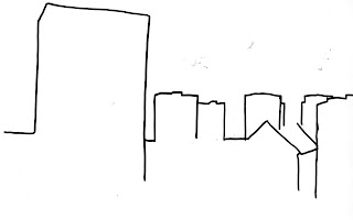
This drawing has quite a lot of lines to reveal and so I assume it will have to work quite fast to fit into the time period of ten seconds for the idents, this was something which was brought up in the crit yesterday as I had it fit into about 5 seconds as a practise it was too fast so this is something I need to play around with, whether it means it draws for the whole ten seconds and others aspects come in as it is still drawing or I try something else.


I just watched this and made the drawing last about 6 seconds, the issue is that it gets quite boring and so I think what I'll need to do is introduce other aspects like the type into it whilst it's still drawing.

I also created a new flag after yesterdays feedback of it being too 'photoshopped' which was fair enough, so I've added some textures too a new flag and changed the hue and saturation a bit.

Going to slice it up and move the layers around again like I did with the previous one but this is as it stands. In black and white and colour but I think my animations need this bit of colour as as of now they are basic black and white.


I don't really like any of them I think this one is better but still it doesn't seem right, maybe still too photoshopped?


Wednesday 26 January 2011

Progress crit


Key things from the crit:
  • explain more on design context blog
  • need to start looking at 50sec title sequence
  • experiment with overlaying things 
  • flag looks too photoshopped, make it more realistic
  • adding just tiny sneaks of colour now and then might look good
  • look at type used in the actual films
  • speed of drawings
  • experiment with colour 
  • research into audio

Revealing original image

In todays workshop Mike helped me with something which I had been wanting to do all along really which was to have my drawing reveal itself along the paths instead of new lines which would be slightly different to my image. I much prefer how this looks and now I know how to do it a lot faster as well I can try combining images for my title sequence. 


I tried out a grey background just because I thought the white looked very clean cut and crisp and this fits better with the theme but I'm still not sure


Tuesday 25 January 2011

Pen tool!

Based on this image I did my first try of drawing it using the pen tool and animating this with paths, I'm not sure what I think about the style it has turned out as but it was a trial.


British flag


I just put this flag together on Photoshop, i didn't want it to be clean cut gleaming so I've tried to make it look a bit dirty and rough with paint brushes don't know if it looks too much like this though, too Photoshopped?


More drawings images


I couldn't really capture the kind of location used in Dead Man's Shoes, myself, so I've taken this photograph from the film and done my own drawing of it. I think this represents it much better than the photos I had.

I've also drawn this scene from Somers Town, I had took photographs of parks and train lines but I think this is more iconic to the movie and people will be able to relate this to it better. I then took it over into Photoshop and created it the correct size.


I don't know if I like these images I've drawn except the Dead Man's Shoes one, I can either try and make them better drawings or choose different images. 

Monday 24 January 2011

Storyboards

Storyboards for idents and title sequence


Artwork


I added a film grain filter onto my photo to make it look more 'gritty' and then I imported it onto After Effects and played around with the opacity without it actually showing 100& opacity across the whole ten seconds just flickering in and out. I think this may be a good idea to use and put the drawings on top because it won't be too dark if they are just fading in and out.


I then added some paths to create lines to draw over the swings, I messed around with the opacity and size of the brush but there's something too simplistic about it, although I like the idea f it drawing, I prefer my drawings that I did but I suppose this is because I've never been very good/confident using the pen tool to create artwork.


I think that the opacity needs to increase so there is less white and you can see the image more but still keep the flickering kind of effect. I also want to incorporate my drawings I think because I like the style of them, I don't know if it'll be too much but I have said all along I want to mess around with layering things on top of each other.

Drawings from photos


I printed out some of the photographs I took yesterday, ones i thought were most appropriate to the film and worked best, I then printed them out in black and white again which I love the effect it produces but I'm still going to stick with drawings. I then made some line drawings form the photographs, I think the park works better than the rail way, I found the railway one quite difficult because it had so much detail with trees and bushes etc.

Sunday 23 January 2011

More photographs

Last time I took photos they were more suited to This Is England or maybe Somers town, this time I've aimed to get photos especially for Somers Town and A Room For Romeo Brass, I went to a few parks new by and also the railway track. I would like to visit the train station to get some for Somers Town as it is set right next to St Pancras.

They aren't of the best quality with regards to colour etc but I aim to print them in black and white again which created a good affect last time.


Friday 21 January 2011

Paths

I have the idea of my drawings appearing and I thought I would be able to do it using a path like I did with text, however it's proving quite difficult.


I quickly drew out a path on after effects as if it would be my line and tried it with text which I am able to do just can't do it with a line!

After looking into a tutorial on how to create a line along a path which you can find here on my design context, I did a quick trial to see if it actually worked for me and it did!


Untitled from Sophie Herring on Vimeo.

Photos and drawings

After I took my photos I printed them out to draw from and I found that printing them on the black and white printer created a really nice, suitable affect.

 This is my favourite only because of accident I printed it out the wrong way but I like how it's turned out being landscape but cut some off to appear wider. If you look closely the printer has created a grainy kind of effect which I think is appropriate for what I want.


 I've done some line drawings from the pictures, I think i prefer the ones with more detail, I'm still not sure whether to combine these with photos of just have drawing, I need to experiment with them and play around to see what works best.


I like the idea of having all this black and white and maybe using the British colours with type or in the background somewhere.