Initial ideas
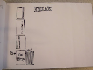
I've drawn out some quick ideas for a logo, I want to keep it simple as I want it to represent a sophisticated, laid-back kind of place. I don't want it to be too obvious either but probably keep with the idea or vertical or lines etc
I've taken these to InDesign and started to look at different type faces, I started with a serif, I think it targets the audience well and also has a theme of head lines for like the Guardian or something which is something I want to incorporate, newspapers. Then I looked at a sans serif and this allowed me to play with line more because they could combine without serifs in the way etc. I need to develop these further still.


No comments:
Post a Comment