


I like this style of the double lines but I'm afraid it looks too typographic with the guide lines, then again maybe the vertical takes this away but it is easier to read like horizontal but the vertical represents stripes better.

This looks awful I was told to look at the IBM logo and use the same kind of idea with vertical stripes but it just looks cheap and childish and pretty bad

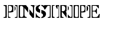
uppercase
I think it could be because the weight of the line is too large, maybe if I try thinner lines they'll look more pinstripe like and more stylish.


I prefer this design with double stripes but only used at the beginning of each letter, the thinner stripes do represent pinstripe better also.


No comments:
Post a Comment