This module has been one of my favourites as we have been able to steer towards the area of design that we have interest in. I think this has helped also by me starting to find where I want to head with my design.
I believe my skills with group work have improved, I really enjoyed the collaborative brief because Kim and I have similar interests and wanted to create the same kind of work. This was the first brief on the course where I have been happy with the outcome. I believe this module has allowed me to develop my type and layout skills further, carrying on from the type module and also build upon my print skills.
My research methods admittedly could have been broader within the design practice brief especially, although I think that I am looking at more relevant context work possibly. With the Fedrigoni brief we were able to gain some of the actual stock which helped develop our work as we new what we were working with.
Within Fedrigoni brief I believe my strengths were generating ideas, Kim and I seemed to bounce ideas off each other and helped each other out with designs etc, whilst one of use did one thing the other did something else so we weren't wasting time. I think my strengths also included keeping on top of work, being organised, improving my Indesign skills, type and layout. Within the design practice brief I think a strength was knowing exactly the areas of design I wanted to work with and knowing subjects I have interest in also. I was really happy with the outcome of the Fedrigoni brief and the way we photographed the end products so I think this is another strength and from here I knew the kind of work i wanted to create. Something I've noticed within myself is my confidence and contribution to crits has improved, they used to be something I was always anxious about but during this module I have overcome this a little and improved my skills.
A weakness within the design practice brief was definitely not listening with regards to screen printing, I was determined to use this method but it turned it i wasted a lot of time and it didn't work out. I also think I have been less organised within this brief and leaving things until the last minute which I don't usually do.
Next time I would listen to advice about not screen printing, experiment more with stock, try to create a more professional finish on all products and possibly use the help of a professional photographer to help me document my final products.
Attendance-5
Punctuality-5
Motivation-4
Commitment-4
Quality of work-3
Quantity of work-3

Showing posts with label product-range-distribution. Show all posts
Showing posts with label product-range-distribution. Show all posts
Friday, 27 May 2011
Thursday, 26 May 2011
Proposed takeaway range


I wanted to keep the bag black so that it doesn't have to look like a takeaway bag like the traditional brown paper bags you get. I have added the name like i have to the cup, in white but want to keep it simplistic.


Maybe the stripe saying take away isn't necessary if i want to steer away from it looking like a take away bag.
I think with it being black it does look a lot better than a standard bag, it would fit in with business men.


Wednesday, 25 May 2011
Invitation
I wanted to make the invitation more interactive so that it is intriguing when customers recieve it. I cam up with the idea of ties or shirts and collars and maybe the shirt being the envelope for the invitation.

I was talking to Steph about my idea and she showed me some origami shirt man she said she's always known how to do so I looked it up and it was so easy to make and hopefully with the right stock and colours etc I can make it look fitting with my audience and brand.


 This is how the invitation would slot into the invation and how it unfolds


I was talking to Steph about my idea and she showed me some origami shirt man she said she's always known how to do so I looked it up and it was so easy to make and hopefully with the right stock and colours etc I can make it look fitting with my audience and brand.

I then tried it with my stock I have used for all products, it was more difficult to fold but using a knife if I score the folds they will be much cleaner and neater


I added some pinstripes to keep the brand running but when printed and folded these didn't have the same feel as I had previosuly been going for, they made the shirt look more like a baseball shirt.


I then tried stripes closer together like the actual invitation and the business card and it appeared to look better, more like pinstripes rather than baseball shirt and hopefully more stylish.


This how the invitation package would look when folded up, with the invitation next to it they work together with the same thin stripes, I think this works a lot better than the stripes further apart
Tuesday, 24 May 2011


Iphone app


I don't like this as the first page, I want it to be more simplistic and and less busy maybe just more white. The lines look different on screen also to when they are printed out so a simplistic approach would work best for on screen

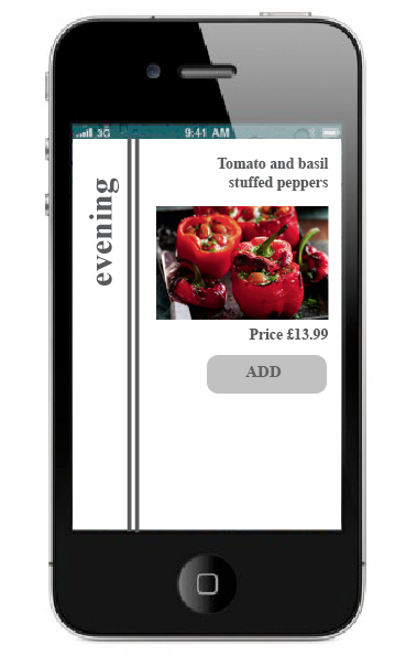

The name of the menus will be down the side so that the customer knows where in the order process they are up to

I've included different option buttons to navigate through the app, keeping each page quite simplistic so it is easy to order and work.

More basic first page


Something which someone pointed out in the crit was to put what it is on the business card as it isn't clear, so I have included this on the app also to make it clear.
Final Crit
Feedback


 Points from the crit:
stripe should be consistent on all menus inside
finish the invite-put info on the back
Details about the restaurant should go on the business card
Propose the app asap


stripe should be consistent on all menus inside
finish the invite-put info on the back
Details about the restaurant should go on the business card
Propose the app asap
Sunday, 22 May 2011
Proposing
I''m quite annoyed with mself because I keep thinking of news things I want to propose but have less and less time to do so.
I'm currently proposing an iphone app, restaurant interior and now I want to proopse a takeaway range- packaging etc.
I'm currently proposing an iphone app, restaurant interior and now I want to proopse a takeaway range- packaging etc.
Thursday, 19 May 2011
Screen prints
So I guess I should have listened in the first place not to waste my time screen printing, I just wanted to do it for my work. However,
 The paper tore for some reason and the dark grey


 Although some did turn out alright the colour wasn't dark enough and I couldn't risk more not turning out how I wanted them to turn out and wasting time and stock.


Wednesday, 18 May 2011
Progress crit


Key points from the crit:
- Rethink leading/kerning
- do posters need stripes?
- menu covers- the type of menu needs to be bigger
- how could I fold the invitation
The crit was really helpful getting outsiders opinions on my work as I wasn't aware some of the provers were illegible so I have revisited them and made some alterations as well as other points made.
Tuesday, 17 May 2011
Invitation


I thought that this was too boring for an invitation, I want it to be exciting and intriguing so I decided to play with something I initially thought about when designing my logo which is creating a background of pinstripes and deleting the text to leave the outlines of the letters.


The problem with doing this on photoshop is that I can not alter the leading and tracking like I have been in my other designs and I really don't like the way it looks with these automatic, they are too spaced out.
This is different to the style of my other designs but is in keeping with the theme with the use of the pinstripes, the invitation will be A5 folded up into four vertical sections.


I was going to fold the invitation into four and have the stripes vertical as they all are but I decided against this.
I experimented with swapping the colours and having the type black, I do actually like this it looks like flock also when it's printed.

Monday, 16 May 2011
Posters-proverbs


I'm going to try these designs with the same pinstripe design as the logo, white stripes down the right hand side of the letters or it may look better differently with different alignments on each poster I need to experiment.


I've decided I want to have four sets of stripes on each one like the logo does so that the brand is consistent throughout the range. There is an exception with one of the posters as it is aligned to the left and so I have included more stripes. If it looks look it doesn't fit in when I print it I will just disregard it.

Subscribe to:
Posts (Atom)